In Defense of Buttons That Make Sense
A reflection on the beauty and clarity of physical buttons, the dangers of invisible UI, and why good design should feel as good as it looks—on screens, and in our hands.

Form Follows Feedback
Inspired by the beautiful post 009 by Nubero, titled "A love letter to buttons," I felt compelled to write my own defense of the physical button. A tribute not only to its tangible presence, but to what it represents: clarity, intention, and immediate response.
There’s something deeply human about pressing a button.
A moment of intention. A small act that gives something back—physically, audibly, emotionally.
It clicks. It resists. It reassures.
We used to design for that feeling. Now we design for glass. And sometimes, it drives me mad.
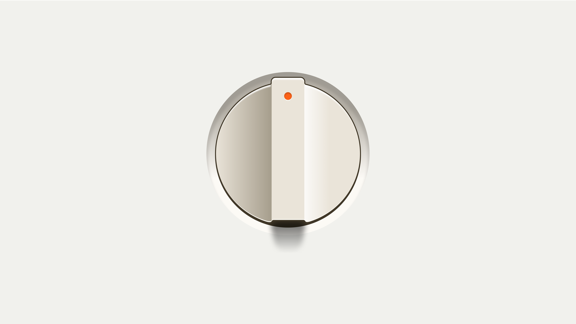
Take my cooktop. It’s sleek. A pure black surface with touch zones that light up like a sci-fi interface. No knobs, no buttons, just silence and smoothness. Until you try to cook.
The second your fingers are damp—or a little oil drips, or the steam builds—the controls stop responding. Or worse, react on their own. The heat rises. Drops. Turns off mid-recipe.
A supposed step forward in design becomes a barrier between you and your intention. What should be intuitive becomes fragile.
This isn’t just a UX quirk. It’s a symptom of something deeper: our obsession with removing things until there’s nothing left. Until even feedback is seen as clutter.
And yet, that’s the thing we miss most when it’s gone.
At Chubby Apps, we talk about this a lot. When we design buttons in our products, we always make sure they feel like buttons. We add haptic feedback—just a tiny vibration—to create a sense of contact. To root the action in your body, even on a screen. Because we know what it means to feel something work. And how strange it is when it doesn’t.
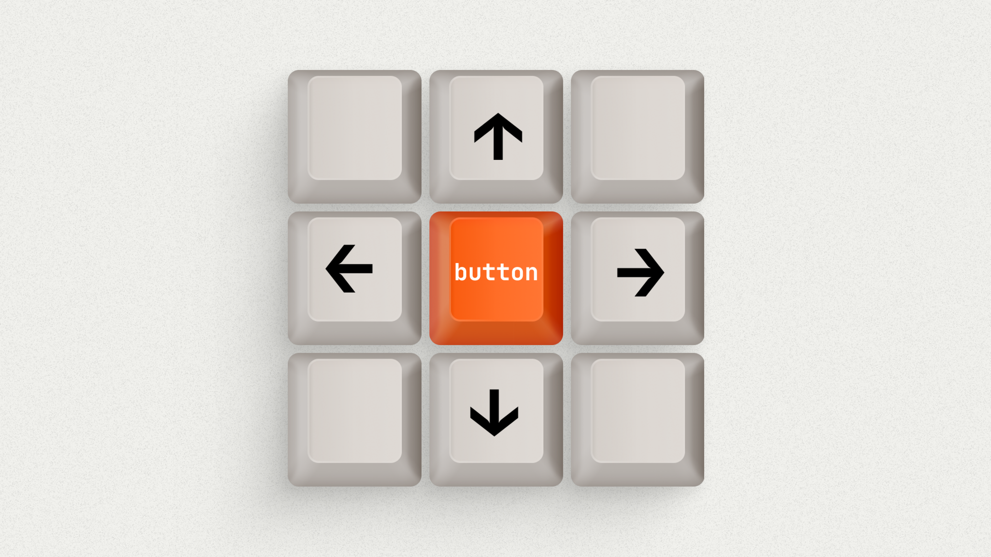
It’s easy to fall in love with visual purity. But minimalism isn’t about making things invisible—it’s about making things clear. And a good button, whether it’s physical or digital, is nothing if not clear.
Dieter Rams said that good design should be understandable. It should speak the user’s language. Physical buttons do that without needing an explanation. Their shape, position, resistance—they all say: “You can touch me. I’ll respond.”
Digital buttons? Not always. Too often they’re just underlined words. No borders. No states. Nothing but ambiguity.
Try handing that to someone outside our design bubble—your dad, your neighbor, your cousin who hates apps.
Will they know where to tap? Will they feel they’ve done something right?
We’ve forgotten what good interaction feels like. Not looks like. Feels like.
But some haven’t.
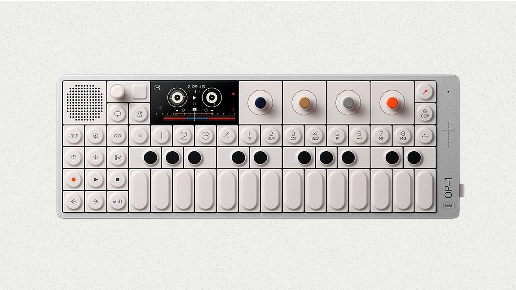
Teenage Engineering, for instance, makes devices that invite you to interact. Their synthesizers are full of clickable, twistable, playable controls. The hardware doesn’t hide complexity behind a screen—it turns it into a playground. Their buttons are joyful. They’re expressive. They’re part of the experience. Not just a means to an end, but an end in themselves.
That’s a kind of generosity we’ve lost in most interface design. Instead, we chase frictionless flows, invisible gestures, “intuitive” actions that only feel natural because we’ve trained ourselves to expect less.
So let’s recalibrate.
When we remove physicality, we have to bring something back.
In digital design, that means making sure a button actually looks pressable. That it has states—hover, active, disabled. That it provides instant feedback: sound, motion, haptic cues. That it respects the hand: enough space, enough clarity, enough confidence.
Design isn’t just what we see—it’s how things behave when we interact with them.
And the truth is: people don’t want less—they want to feel more in control.
Designers, developers: we’ve got work to do
So here’s what I remind myself (and my team) when designing any button, on any platform:
• Make it obvious it’s a button.
• Make it respond, instantly.
• Put it where people expect to find it.
• Let it do only what it promises.
• And make sure it works even when the user’s stressed, distracted, or halfway through dinner.
These aren’t rules. They’re respect. For context. For human fingers. For the idea that design is more than visuals—it’s interaction.
We shouldn’t have to defend buttons. But in an industry so obsessed with disappearing the interface, maybe it’s time we do.
There’s beauty in tactility. Power in responsiveness.
And yes—joy in a button that simply works.
Let’s design with our fingers, not just our eyes.
Patricia Bedoya
Cofounder & Design Lead at Chubby Apps